Beginners Guide to Painting Outdoors
by Plein Air Alberta
The information below outlines my own methods and painting process when tackling an outdoor scene. It includes fundamental practices and tips that I’ve used over the years to make the painting process easier to manage and more enjoyable when struggling with the various challenges plein air painting can present. Hopefully some of these ideas and tips will help beginners find their own path to more successful paintings.

Step 1 – A simple sketch
This is the most important step in creating a successful painting! Most experienced artists would agree that for a painting to be successful, you need to give it a simple and solid framework onto which you can build as much complexity as you feel it requires. This is the very core of good composition, and without it, you’ll find your paintings will never quite feel “right”! If the composition fails, it won’t matter how well executed the rest of the painting is.
Take some time to study your scene
Something about the scene in front of you sparked your imagination. Identify what that is and make either a mental or literal note of it. This is the story and focus of your painting that you will try and convey to the viewer. It might be as simple as the obvious subject in the scene (a tree, a bridge, or distant mountain peak), or maybe the light is catching the tops of the buildings against a grey sky, or you might see a variety of subtle colours in the shadows of a shaded cliff. Whatever it is that caught your eye, keep that in your mind as you proceed as it will inform all your decisions moving forward.
A Frame of Reference
You can use a view-finder or the thumb and forefinger of both hands to create a rectangle that encompasses the scene and mirrors the proportions of your chosen painting surface. Often, making a very simple thumbnail sketch from this rectangle can help solidify the basic view and composition, and allow you to quickly rough in the horizon, the main shapes and tonal areas, and assess the overall balance and focus of the composition (as described in more detail below). You can try adjusting size and position, or even removing elements to help the composition work.

A quick tonal thumbnail or two can often help work out the basic compositional shapes and tonal areas.
identify the horizon line
Even if it’s obscured by trees or hills, etc., you should be able to identify it by holding your brush or another straight edge out horizontally at arms length in front of you at eye level, and noting where it falls across your scene. You can play with the position of this on your canvas depending on whether you want to have more or less sky in your scene. Once you’ve got an idea of the proportion of sky to ground you’d like to show, draw a line across your entire canvas (I use the edge of a spare canvas board), or alternatively, make two marks on the left and right edges of your canvas to remind you of the horizon’s location. This is a key horizontal in your painting as all perspective lines will converge to one or more points on this line.
LOOK FOR the BIG SHAPES
Try and break down the view into large masses like; immediate foreground, prominent foreground objects like trees and buildings, mid-ground area, background, and sky. Try to make these masses distinct from each other by size and overall shape, as this will provide variety and visual interest in your composition. You should consider main areas of light and shadow in the scene and use these to create these main shapes also. Although not essential, it’s often useful to add a shadow pattern to the sketch defining your darkest darks, blocking in the prominent shadow areas using either thin paint or hash lines (this will mimic your thumbnail sketch if you’ve done one).
Use these shapes to simplify everything down to its most basic form, and consider how these shapes might lead the viewers eye into and around the painting. Consciously reducing the scene in to these shapes will not only provide a solid structure for your composition, but will make the visual complexity of nature a lot easier to handle. It will also force you to consider design of your scene right from the start.
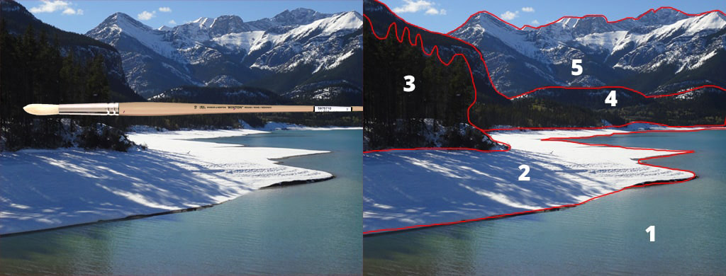
Left: Holding a straight edge up to eye-level helps pinpoint the horizon line, even when obscured. Right: Identifying the main masses or visual shapes helps define and simplify the overall design of the composition.
Make your sketch
Once you’ve got a handle on the main shapes and the position of the horizon, draw a simple sketch of these with thinned paint using a round brush. You can use pencil or a charcoal stick to make the sketch if you prefer, but this can effect or muddy your lighter colours when you paint. You can use any colour you like, but a popular choice is a warm reddish brown like Burnt Sienna or Venetian Red. Keep a rag handy to wipe off the paint if you make an error. Oil paint thinners like mineral spirits will allow the paint to move more easily while you’re sketching, and your drawing will dry quite fast… so you can paint over it almost as soon as it’s complete.
The detail you include will vary depending on the scene, but include main areas of light and shadow, and those major shapes and prominent forms identified above. Don’t be too fussy, and keep your composition (and thumbnail if you made one) in mind as you layout the design of your painting. I can spend up to 30 mins getting this right sometimes.
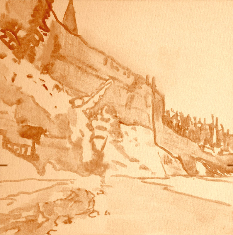
This is a fairly detailed sketch, but the cliff face was complex enough that I wanted to make sure I had the core shadow and light shapes correct, as well as indicate areas of colour and direction in the rock strata.
Quick Tip
Try toning your canvas beforehand
Use a warm neutral colour (honey brown or warm grey) and cover the painting surface evenly. This base tone gets rid of all that intimidating white area, reduces glare when out in the sunshine, and gives you a neutral tone that allows for better value and colour judgement, as well as creating an overall colour harmony where it shows through your brushwork. I don’t recommend using a bright or unnatural tone like pink/purple or a vivid blue, at least not while you’re learning, as this makes judging accurate colours much more difficult.
Thin down your paint and cover the surface evenly. Wipe of any excess with a rag so the tone isn’t too dark (you’ll have to play with this until you find the right tone for you – mine is roughly equivalent to a 30% grey value) I recommend an acrylic wash to tone your surface, as it dries quickly. Oil painters can use an oil based tone if they prefer, but you may have to prepare your canvas well before a painting excursion to maximise painting time on site.
Important: Do NOT use an oil paint base tone if you plan to paint in acrylics. (i.e. oil over acrylic is ok, acrylic over oil is not)
Step 2 – Shadows & Block In
- Start with your darkest darks – Establishing the darkest areas in the scene first gives you a starting point from which all the other tonal levels will be judged.
- Next, proceed to add areas of local colour – This is the predominant colour and tone of the main shapes if you ignore the shadow and highlight areas of a shape. Use tonal shifts in local colour to add depth and perspective to a scene, darker colours will come forward while the lighter colours will recede.. generally. Intensity of colour can also add greater depth, so keep your saturated colours for closer objects and desaturate or grey down with a complimentary colour those colours that appear in the mid to background.
- Leave the light areas alone for now – Your canvas or base tone can act as your lightest light for now while you judge the darks and mid-tones.
Step 3 – Add Some Highlights
At this point, you need to stand back and evaluate the overall composition. Does it still match your initial vision and goal. If it doesn’t, identify where it fails tonally and adjust your colours (most likely the mid-tones) so it reads correctly. Once you’re happy with the overall block-in, you can paint in the light patches and highlights. Try not to use white to lighten colours in the mid to foreground as it will desaturate your colours which makes them recede visually. Try and keep your use of white to background and sky shapes.
Quick Tip
Avoid using white for as long as possible.
Focus on your darks and mid-tones, and keep the colour mixes as pure as possible. White will make your colours milky and recede, and should be kept mostly for backgrounds, distant objects, and the sky.
Step 4 – Leave the Details to the End
It’s important to get the underlying structure of a painting working first before you start adding too much detail. The amount of information in nature can easily become overwhelming, so keeping your focus on the bigger picture allows you to create a solid foundation before you add anything else.
But, once you get the painting to a level where you’re ready to move on, start to emphasize your point of interest or focus using more detail. Detail is one of the fastest ways you can grab the viewers attention, so consider not detailing everything the same, but rather use it to draw the eye to those features in the scene that initially drew yours. Sharper edges, small bright highlights, and even redefining small areas of deep shadow all add details and definition that can tell your painting’s story more effectively.
Quick Tip
Start your painting using the largest brush you feel comfortable with, and then use it for as long as you can.
This will force you to stay loose and expressive, and avoid getting too fixated on the fine details too soon in the process.