Supplies
The implication of moving your painting studio outside is you have to have access to everything you need to complete your artwork available at your painting location. Weight, size, and mobility become important concerns, and learning how to minimize your portable supplies can increase your painting time, and your enjoyment of the outdoor painting experience.
Painting Surfaces
Most plein air painters will use painting boards of some description. These are thin canvas covered cardboard sheets which are light, compact, inexpensive, and come in sizes ranging from 4″ x 6″ up to 16″ x 20″. The larger they are, the more likely they will warp (especially the cheaper brands), so most of these boards are “8” x 10″ or smaller, and are used primarily for colour reference sketches. If you like more robust boards to paint on, ones that you might frame at some point, I’d suggest using the pre-coated hard board panels you can purchase at most art supply stores. Most common forms of these are smooth, so you don’t have the canvas texture if that’s your preference, although I have seen some that have a piece of canvas or linen glued to them. There are also versions of these that use light-weight fibre-board, or even aluminum as the support.
I prefer to make my own since I like to use custom sizes of board (most commonly square 12″ x 12″). I buy either hardboard (masonite) or MDF particle board sheets from my local hardware supplier, cut them to the sizes I want with either a table saw or even a utility knife, and then glue sheets of heavy cotton canvas or linen to one side. This can be trimmed to the edge of the board, and then painted with several coats of gesso. These are NOT archival quality boards by any means, but they give me the versatility of shapes I’m looking for, and I can coat and sand them to just the right surface quality (I don’t like the shiny smooth boards as the paint tends to slip around too much). It’s more work I grant you, but this way I get custom boards to the quality I like, and for very little money. Then I’m not so concerned about the inevitable days where things don’t work out too well.
If you’re really serious about completing full paintings on site, you can of course haul out one or two larger canvases to paint on. Keep in mind you’ll have to trek back with a wet painting if your location requires a hike, and the wind can really catch those larger surfaces like a sail. This is only a real concern for oil painters as acrylics will dry in a few minutes usually. Your portable studio will have to accommodate larger surfaces, and I’d recommend bringing a bag to fill with dirt or rocks and hang this under your easel to add some weight while you paint. The wind is the most common reason painting setups tip over often ruining your work.
Paint & Pigments
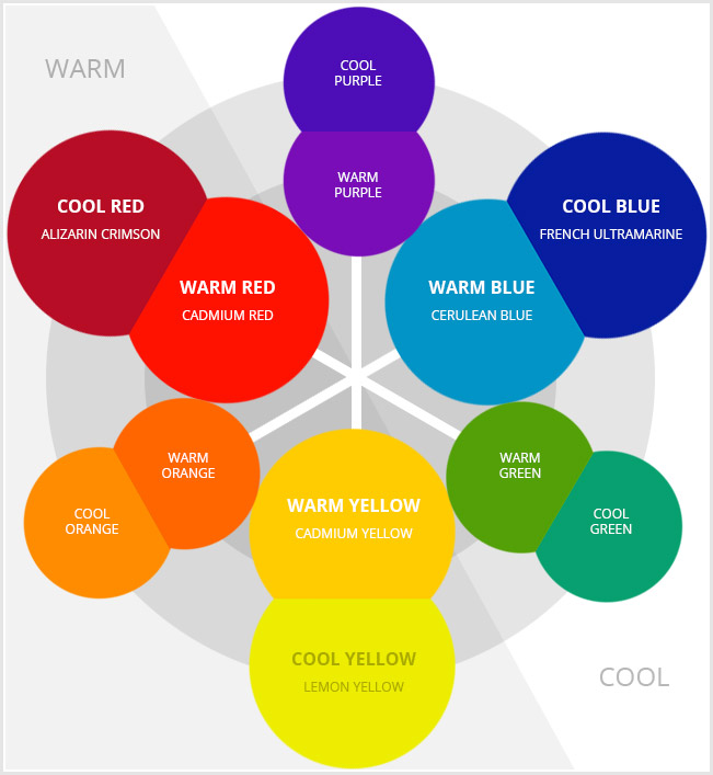
The Split Primary Colour Palette
You can save yourself a lot of time by limiting your colour palette from the get go. I’ve found that keeping my paint tubes to the bare essentials allows for greater colour harmony in most paintings, and keeps the weight and costs down for beginners.
So, a “split primary” palette is essentially a warm and cool pigment from each of the three primary colours (red/yellow/blue). By mixing two primary colours, you get a secondary colour (red mixed with yellow gets you orange, etc.) But with a split primary palette, each primary has a warm and a cool version which gives you a quite different secondary colour. A basic colour wheel can help explain how primary colours and secondary colours can be mixed.
Basic colours to start:
- Permanent Alizarin Crimson (cool red)
- Cadmium Red Med. (warm red)
- Lemon Yellow (cool yellow)
- Cadmium Yellow Med. (warm yellow)
- French Ultramarine (cool blue)
- Cerulean Blue (warm blue)
- Titanium White (cool)
You can use the complimentary colours to grey down or mute these pure colour mixes. Take the colour opposite on the colour wheel and mix a little of this (cool or warm) into the opposite mix to “dull down” the colour for a more natural looking colour. So if you want a more natural green for tress and grass, etc., take a red and add to your green mix. You won’t need a lot to make a big difference, so add a little at a time so you don’t over shoot your target colour. You can create some good browns and greys this way without buying special colours for that.
I’ve also added a couple of other colours to my palette for time saving, and to use along with complimentary colours as neutralizers/greyers:
- Yellow Ochre (warm)
- Burnt Sienna (cool)
(This is an approximation as all pigment brands will mix differently and with different transparency and intensity)
Colour temperature is difficult to explain, but here goes. Generally, colours are described as either warmer or cooler based on our perception and their relation to surrounding colours. So as a rule, reds, oranges and yellows are generally considered to be warm colors, and blues and greens are generally considered to be cool colors. But in art pigments, there are warm and cool ranges within a single primary colour. So you can have a warm yellow like Cadmium Yellow Medium, and a cool yellow like Lemon Yellow. Mixing these three primaries with another warm or cool primary can yield quite different results. Check out this basic demonstration from one of my favourite plein air YouTubers. Also, warmer colours will come forward while cooler colours will recede. You can add other custom or support colours as you need to over time, but learning to mix from a limited range of colours will help you greatly in the long run. There are many options within different brands of paint; paint grades, pigment purity and consistency, and so on.
Quick Tip
I don’t recommend beginners using black paint, as a pure colour, and especially not to “grey” down other colours. It can easily overwhelm any other colour and “kill” it. You’ll end up with flat, lifeless mud, and you’ll be scraping it off and wasting a lot of paint. However, the only reason I’d consider adding black to your palette is black, when mixed with yellow, can give you some natural greens with very little effort. Small amounts of Ivory Black added to Lemon Yellow can give you some very nice olives and neutral greens for those Rocky Mountain pines. However, it’s better to avoid it all together until you’ve gained some understanding and confidence mixing colours.
Thinners & Mediums
To come…
Brushes & Knives
To come…
Other useful supplies
To come…